

The presence of diverse screens has become an integral part of our daily lives—from smartphones to tablets and computers. In this context, merely having a traditional website is no longer enough to ensure success in the digital world. We have moved beyond the era when designing for desktop was the standard. Adapting to different screens is no longer just a visual enhancement, but an essential component that cannot be ignored. Responsive Web Design (RWD) has become the ideal solution, shifting from a complementary feature to a fundamental necessity for anyone aiming to excel in the digital environment.
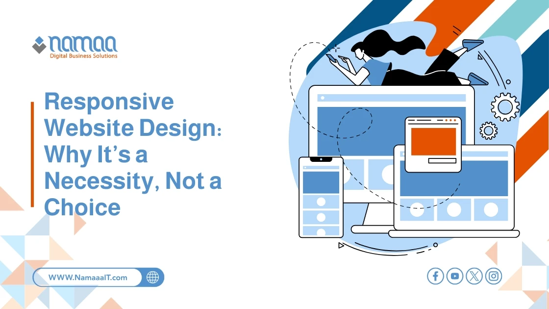
What is Responsive Web Design?
Simply put, responsive web design is an approach to website development and design that aims to create an optimal browsing experience for users, regardless of the device they are using. Whether the user is browsing on a small smartphone, a medium-sized tablet, or a large desktop screen, a responsive website automatically rearranges and adapts its content and elements to fit the screen size.
This approach relies on using fluid grids, flexible images, and CSS media queries to detect device characteristics (like screen width) and apply appropriate design styles. The goal is to ensure easy reading and navigation with minimal scrolling, zooming, or resizing.
The past decade has witnessed a dramatic shift in internet browsing behavior. Global statistics clearly show that the majority of website visits now come from mobile devices. This shift is no coincidence—easy and convenient access to information and services via smartphones has become part of our daily routine. Ignoring this reality means ignoring a vast segment of your potential audience. A poor mobile experience—such as hard-to-read text or buttons that are too small—drives visitors away instantly in search of a better alternative. This behavior not only affects immediate conversion opportunities but also negatively impacts your brand’s reputation.
Responsive Design & Search Engines
Search engines—especially Google—no longer overlook the importance of the mobile experience. In fact, it's become a critical factor in determining your website’s ranking in search results:
Mobile-First Indexing: Google has officially adopted a mobile-first indexing policy, meaning it primarily uses the mobile version of your content for indexing and ranking. If your website isn’t responsive or doesn’t provide a good mobile experience, your visibility in search results can be significantly affected—even for searches from desktop devices.
Single URL for All Devices: Responsive design provides a single URL for all versions of your site, instead of creating separate subdomains (like m.example.com) for mobile. This simplifies Google’s indexing, avoids duplicate content issues, and consolidates backlink authority to a single domain—boosting your site's domain authority.
Reduced Bounce Rate: When users find the site easy to use and appealing on their devices, they are more likely to stay longer and engage with the content. This lowers the bounce rate (the percentage of visitors who leave after viewing only one page), which is a positive signal to search engines about the quality and relevance of your content.
The Ideal User Experience
User Experience (UX) is the ultimate goal of any successful design. Responsive design plays a central role in delivering an ideal user experience across all platforms:
Ease of Reading and Navigation: Responsive design ensures that text is clear and easy to read without zooming, and that menus and buttons are appropriately sized for touch interaction.
Fast Load Speed: Responsive sites are often optimized for faster loading on mobile devices through image optimization and file size reduction. Fast loading is crucial for user satisfaction, as users expect pages to load within seconds.
Visual Identity Consistency: A responsive design maintains your brand’s visual identity consistently across all devices, helping users recognize and trust your brand.
Increased Engagement: A site that is easy to use and visually pleasing encourages users to engage with content—whether by leaving a comment, sharing the article, or completing a purchase.
Explore: Common Web Design Mistakes
Benefits of Responsive Design
Beyond the obvious improvements in user experience and SEO, responsive design offers additional advantages that may not be immediately apparent but significantly contribute to your digital strategy's success:
Broader Reach: By catering to users of various devices, responsive design ensures you reach the widest possible audience. This prevents losing potential customers who might abandon your site due to difficulty navigating it on their preferred devices.
Improved Conversion Rates: A smooth, intuitive browsing experience encourages users to take desired actions, whether it's purchasing a product, signing up for a newsletter, or filling out an inquiry form. The easier and more straightforward the path to conversion, the higher the likelihood of success.
Cost and Effort Savings Long-Term: While the initial investment in responsive design may be higher than in a fixed layout, it’s more cost-effective in the long run. Instead of developing and maintaining two separate versions (desktop and mobile), you manage a single database and content set—saving time, effort, and financial resources.
Stronger Brand and Credibility: A website that looks and functions well on all devices reflects a modern, professional brand. It shows your customers that you care about their experience and keep up with technological trends, increasing trust and credibility.
Future-Ready: The tech world is constantly evolving, with new devices and screen sizes appearing regularly. Responsive design, by its flexible nature, makes your website more adaptable to these changes without the need for a full redesign every time a new device is introduced.
read more: Top 10 Features Your Company Website Must Have
Common Challenges in Responsive Web Design and How to Overcome Them
Despite its many benefits, designers and developers may face some challenges when implementing responsive design:
Website Performance & Loading Speed: Loading the same high-resolution images intended for large desktop screens on mobile devices can slow down the experience. The solution lies in image optimization techniques (like responsive images that serve different sizes based on the screen), file compression, and effective caching.
Complex UI Design: Interfaces with large amounts of data or interactive elements (like large tables or complex dashboards) can be hard to adapt for small screens. This requires careful planning, content prioritization, and possibly rethinking how information is presented on smaller devices.
Comprehensive Testing: Ensuring your site works flawlessly across a wide range of devices, browsers, and operating systems requires significant testing. Using device simulators, along with actual testing on real devices, is essential.
Overcoming these challenges requires expertise and thoughtful planning, but it’s a necessary investment to ensure a high-quality final product.
Is Your Website Responsive?
If you're unsure whether your current website is responsive, you can run a few simple tests:
Google Mobile-Friendly Test: A free tool where you input your site’s URL to see if it’s mobile-compatible, along with suggestions for improvement.
Resize Your Browser Window: On a desktop, open your site in a browser and gradually shrink the window width. Watch how the layout adjusts. If the content remains readable and organized without needing horizontal scrolling, it’s likely responsive.
Browser Developer Tools: Most modern browsers (like Chrome and Firefox) include developer tools that let you simulate how your site appears on different screen sizes and devices.
Manual Testing on Different Devices: The most reliable method is to open your site on actual smartphones and tablets to directly assess the user experience.
The debate is no longer about the importance of responsive web design; it has become an essential industry standard.
In a world increasingly reliant on mobile devices, ignoring this approach means risking the loss of customers, a decline in search engine rankings, and presenting an unprofessional image of your brand. Investing in responsive design is an investment in user experience, SEO, and your website’s future scalability. It’s a strategic decision that reflects a deep understanding of modern digital audience behavior and the demands of a competitive market.
It’s time to shift from seeing responsive design as an option to recognizing it as a non-negotiable necessity for building a strong and sustainable digital presence.
Summary
✅ Mobile Dominance: Over 58% of global website visits (exceeding 70% in some regions) now come from mobile devices—ignoring them means losing the majority of your potential audience.
✅ Search Engine Priority: With Google’s “mobile-first indexing,” non-responsive websites can drop in rankings by 30% or more in mobile search results, and a single URL is preferred to boost link authority by 100%.
✅ Optimal User Experience: Users are 5 times more likely to leave a non-mobile-friendly site. Responsive design can reduce bounce rates by 10–20% and increase session duration.
✅ Higher Conversions & Reach: Businesses may lose over 60% of potential mobile customers due to poor experiences, while responsive design can increase mobile conversion rates by 15% or more, depending on the industry.
✅ Cost-Efficient & Future-Proof: Responsive design can save up to 50% in annual development and maintenance costs compared to managing two separate versions of a site. It also ensures compatibility with hundreds of future screen sizes.